The Muse Connection Volume 1 involved a talk on Colour Theory, given by Helen Stewart of Curious Handmade. I made a few notes and have had a chance to think about it since. What I’ve realised over the past few days has surprised me.
Colour Theory
If you’ve been around here the last two or three weeks, you’ll know I cast on Naloa by Renée Callahan using Kettle Yarn Co. yarns in Electric Aramanth (Beyul) and Dark Media (Westminster). I’ve been knitting away on it quite happily, and this weekend I started knitting the contrast colour onto the edge. I love the knitting. I love the yarn. I love the pattern. But, I was feeling strangely uncomfortable.
I wasn’t entirely sure why, but looking at the project made me feel strange. You can probably guess what the reason was, given the title of this post. I decided to take a photo of the project using the ‘Mono’ filter on my iPhone – this is what Helen recommended to use, to see if the yarns went together in greyscale. What I discovered fair blew me away. Before carrying on, here’s a definition you’ll need to know.
Chroma refers to the purity of a color. A hue with high chroma has no black, white or gray in it. Adding white, black or gray reduces its chroma. It’s similar to saturation but not quite the same. Chroma can be thought of as the brightness of a color in comparison to white.
In design, avoid using hues that have a very similar chroma. Opt instead for hues with chromas that are the same or a few steps away from each other.
To test the theory, I gathered a few other striped projects together, in which I really like the way the colours play together. One is my beloved Zigzag Jumper, the other my Saguaro Cowl from a few weeks ago. The tea cosy was sent to me by Alice of The Sequinned Sheep, and the sock is a self-striping Biscotte and Cie yarn. I took photos of all of these projects in full colour, then using the mono filter. I also took a few close-ups, which my handy slideshow will scroll through for you. Do take a look at these before reading on – I’d be interested to know what you think before you read my thoughts.
Can you see how all of the projects except Naloa have a striped effect that looks just as good in monochromatic as in full colour? Side-by-side comparisons will help.
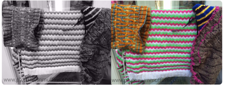
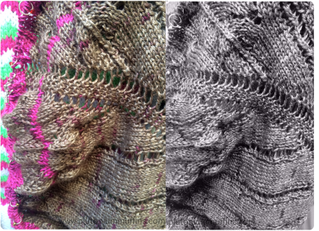
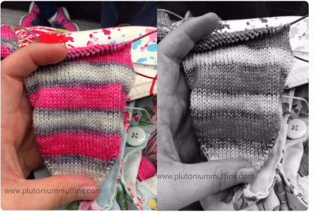
I am fascinated to see this theory in action like this. Will I be ripping Naloa out? No, not likely – but it really says a lot for buying yarn on the Internet (I hadn’t seen Electric Aramanth before it arrived) as well as how to think about your projects before you start them. I suppose this would also work with a fairisle pattern – if the pattern doesn’t show up with a mono filter applied, you know the colours may not be the best.
All of that said, this is all still theory, and relates back to the idea of ‘ugly‘ I was talking about the other day – it’s all about perspective, and if you like it, great.
I hope this has been understandable – if I can clarify anything, please let me know!
Much love,
Corrie xx





Thanks for this. I generally like high contrast stripes, and there are times that I look at something and think that the colors aren’t QUITE right, but can’t sort out why I think that. This idea of taking black and white pictures is a great tip that I’ll have to try the next time I’m having this problem.
The best filter to use is the ‘mono’ one on an iPhone (I’m not sure what the equivalent is on other phones, I’ll do some research and let you know!) I hope it helps you out, let me know if you make any colour choices using the method :)
Wow, very interesting and informative!
I’m so pleased you found it so! May your colour choices be ever in your favour :)
Wow! Oh my, this is wonderful info. It’s funny, because I did what you said, and looked at the photos first, and low and behold, my thoughts were spot on with what you said following. Crazy!
It’s so weird to see it in action, isn’t it?? Absolutely love this method, going to try it out all the time :)
Thanks so much for this. I “monochromed” my colour choices for a throw and I can clearly see that I have to do the border white to get the right effect. Some of the colours will not work together and I may drop a couple completely.
Thanks for sharing that information. It’s something to keep in mind next time I struggle with color choices.
Very interesting!
Very interesting! I’ve tried this once, but just to see which color contrasted MORE. Never did see a value that doesn’t work well. Very helpful.
This is a great read! Filled with info and examples. Very interesting.
I chose this as one of my EyeLoveKnots Yarn Favorites from the Yarn Fanatic Party #33, and featured in this week’s.
Thanks for sharing with us!
Alexandra
EyeLoveKnots.blogspot.com
#34: http://eyeloveknots.blogspot.com/2015/04/yarn-fanatic-linky-party-34.html
An amazing analysis – it was very helpful to me when I considered how some of my drawings and paintings are constructed. Thank-you!